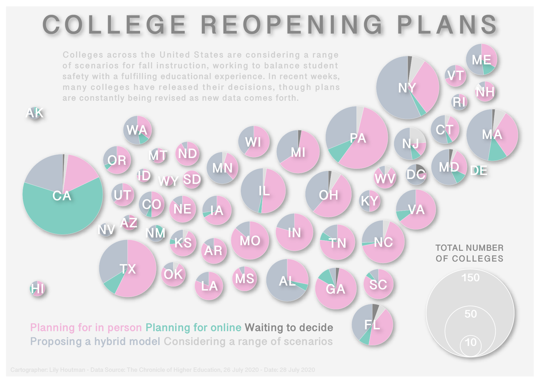
College Reopening Plans, July 2020

This map is a play on the traditional Dorling cartogram, using pie charts instead of circles of one hue. Circle size is scaled to the number of colleges in each state (that reported their reopening plans). Color and orientation were used to show each college's plan. Clearly, pink for in person rises to figure, highlighting the optimistic ideas that many colleges held in July of 2020.