Human Evolution in a Calendar Week
Inspired by Carl Sagan’s description of the age of the universe over a calendar year, I chose to tell the story of human evolution over a calendar week. I used ArcGIS Story Maps, which allows for an easy “scrollytelling.”
These seven million years of evolution divided nicely into the seven days of the calendar week. I begin the map with a lot of empty space, mirroring the scarcity of the fossil record at these early timestamps. As the fossil record becomes more plentiful, so does my story. Eventually, the story is packed with information, intentionally overwhelming, allowing the reader to understand the massive impact that humans have had on the planet in just a few thousand years.
The story begins with a lot of gentle colors and simple maps: natural tan and green tones are used to create a peaceful setting, and simple locator maps show the position of famous fossils.
As the story unfolds, I used the Map Tour feature to jump quickly between locations, jarring the reader as humans advance across the planet.
At its conclusion, the tone of the story quickly shifts. Focused on human-caused climate change, my two maps (one created through ArcGIS Online, the other through ArcMap and Adobe Illustrator) shift to a grey and black industrial tone, highlighting human-caused CO2 emissions.
The story concludes on a hopeful note: countries are beginning to realize the impact that we have had on the planet. Though we are just a blip in human history, we have a unique self awareness that may save our planet.
Above, you can view the story for yourself. Below, I describe a more detailed view of my stylistic choices.

In addition to studying cartography, I also study anthropology, specifically paleoanthropology (the study of human ancestors). Wanting to practice my science communication skills, I decided to map a topic that I know we. The header image is of casts from my field school in South Africa from the summer of 2019.

I began this map by equating each day in a calendar week to one million years of human evolution. Design-wise, I used light greens and browns to emphasize the natural landscape of Africa that our ancestors evolved in. I used a simple basemap to locate famous fossils, with pictures of the fossils included.
I dated each event in human evolution not only to a day, but a time of day. However, for the first few million years, there are not many fossils. I included blank space during these early times so each day takes the same amount of time to scroll through.
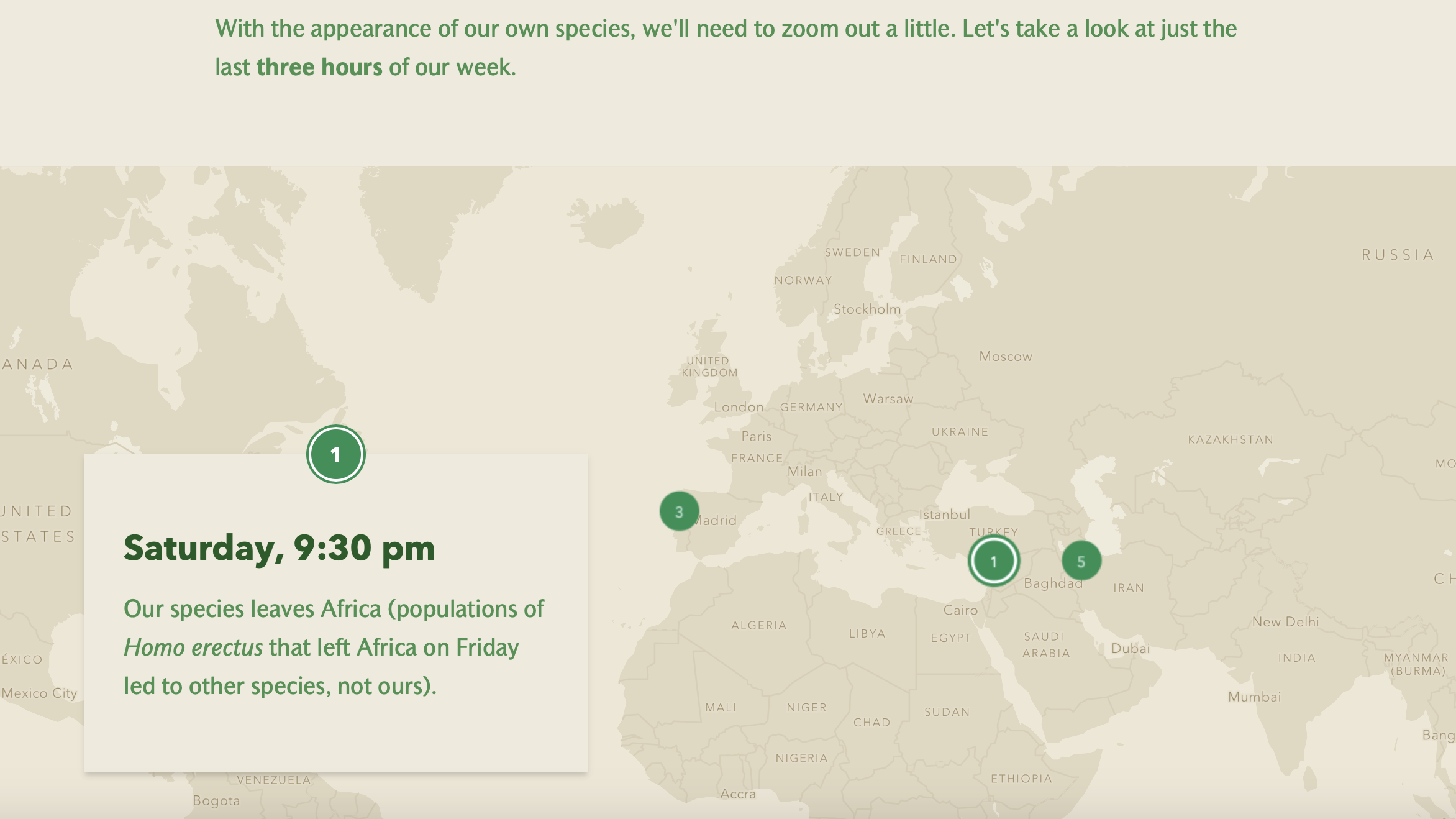
By Saturday, events in human history get more complex and rapid. I placed these major events in one map, at a small scale. Then, when the user scrolls to the next event, the jump between a close up of the Middle East to a close up of Australia feels especially rapid, echoing the speed of human dispersal.
I ended the section on evolution with the last few 100 years, hoping to connect the human story to the individual life of each viewer.

After connecting the user to their own life, I rapidly shifted the tone of the map. I used dark blacks and greys to show the impact of CO2 on our planet. This map is interactive, so the user can see the stark difference between CO2 in the early 1900s compared to present day.

I used the same tone for a second modern map, but this one is slightly more optimistic. Here, I presented very recent declines (for many, but not all countries) in CO2 use. I argued that only through continued action of a similar level can we preserve our planet for future humans.
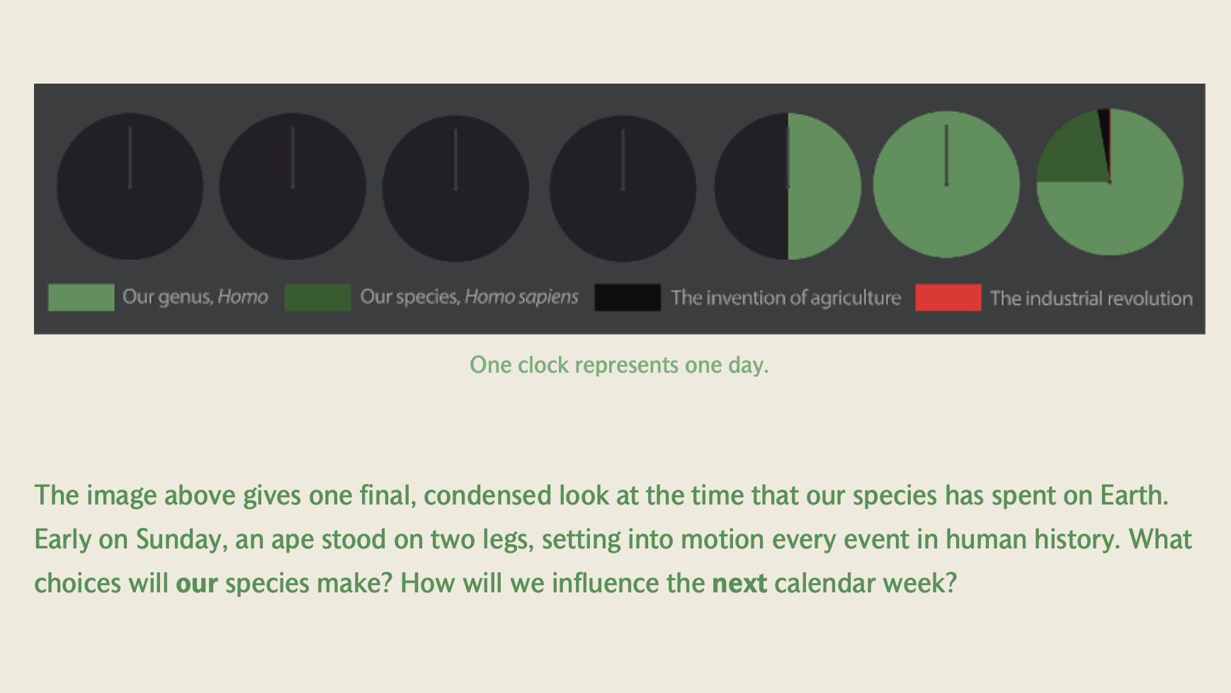
I ended this story with a call to imagine how we will impact our planet for its next calendar week. I included a condensed timeline of the same information that I previously explained. I intentionally followed the same color scheme as before, with the red line for the industrial revolution as barely visable, to illustrate that small amount of time that our planet has been in this industrial age.